The Document panel is the main content area where the artwork is displayed and edited using tools within the viewport. It's also where the node graph can be overlaid by pressing CtrlSpace.
The viewport is for interactive, visual editing of the canvas. The node graph is where you can inspect the underlying structure of the document and edit it in a more technical manner when the need arises.
There is one instance of the Document panel per open document file. Each has its own tab labeled with its file name. When a document has unsaved changes, an * is included at the end of the name.
The Document panel is composed of three main areas:
- The control bar runs across the top of the panel and shows tool and viewport controls.
- The tool shelf is the vertical bar that runs down the left of the panel showing the editing tools and working colors.
- The viewport fills most of the panel and contains a view of the canvas which can be interactively edited using the tools.
Control bar
Here is where you control your interaction with the document via active tool and view options.
Tool controls
The left side of the control bar has controls pertaining to the active tool. It's empty for some tools.

The example above shows the Select tool controls. Because the Select tool deals with selecting and transforming layers, its controls include:
- The selection mode to determine if the deepest or shallowest layer in a nested hierarchy is selected when clicked.
- The point about which the transform cage is centered.
- Actions to align and distribute the selected layers amongst themselves.
- Actions to flip the selected layers horizontally or vertically.
- Actions to cut or combine selected layers with themselves using boolean operations.
Depending on which tool is active, these will change to reflect the pertinent options.
Viewport controls
The right side of the control bar has controls related to the active document and viewport.

| Overlays | When checked (default), overlays are shown. When unchecked, they are hidden. Overlays are the temporary contextual visualizations (like bounding boxes and vector manipulators) that are usually blue and appear atop the viewport when using tools. |
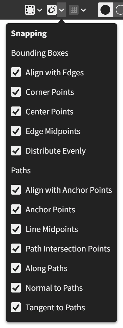
| Snapping | When checked (default), drawing and dragging shapes and vector points means they will snap to other areas of geometric interest like corners or anchor points. When unchecked, the selection moves freely.
Snapping options relating to Bounding Boxes:
Snapping options relating to Paths:
|
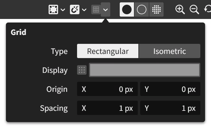
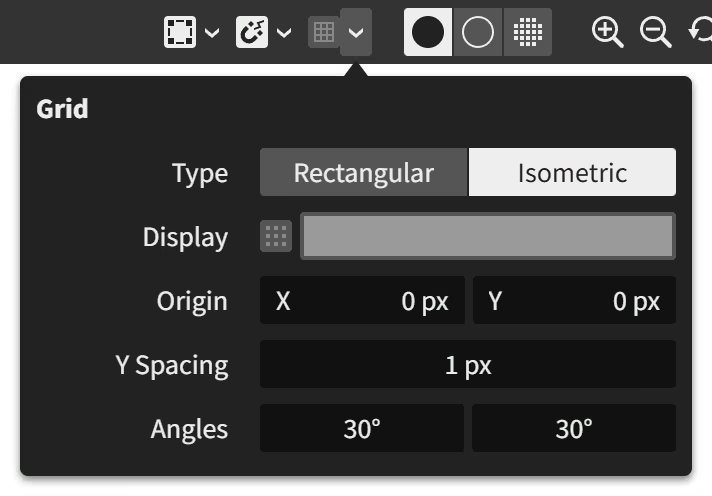
| Grid | When checked (off by default), grid lines are shown and snapping to them becomes active. The initial grid scale is 1 document unit, helping you draw pixel-perfect artwork.
|
| View Mode | Normal (default): The artwork is rendered normally. Outline: The artwork is rendered as a wireframe. Pixels: Not implemented yet. The artwork is rendered as it would appear when exported as a bitmap image at 100% scale regardless of the viewport zoom level. |
| Zoom In | Zooms the viewport in to the next whole increment. |
| Zoom Out | Zooms the viewport out to the next whole increment. |
| Reset Tilt and Zoom to 100% | Resets the viewport tilt to 0°. Resets the viewport zoom to 100% which matches the canvas and viewport pixel scale 1:1. |
| Viewport Zoom | Indicates the current zoom level of the viewport and allows precise values to be chosen. |
| Viewport Tilt | Hidden except when the viewport is tilted (use the View > Tilt menu action). Indicates the current tilt angle of the viewport and allows precise values to be chosen. |
| Node Graph | Toggles the visibility of the overlaid node graph. |
Tool shelf
This narrow bar runs vertically down the left side of the Document panel beside the viewport.
Tools
Located at the top of the tool shelf area, the tool shelf provides a selection of tools for interactively editing the artwork.
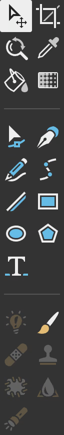 | The tool shelf is split into three sections: the general tools (gray icons), vector tools (blue icons), and raster tools (orange icons).
|
Working colors
The working colors are the two colors used by the active tool.
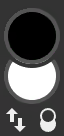 | The upper circle is the primary color. The lower circle is the secondary color. There are two buttons located underneath: Swap which reverses the current color choices, and Reset which restores the primary color to black and the secondary color to white. |
The tool controls (above the viewport) for some of the tools offer choices for using the primary and secondary colors. For example, the vector drawing tools have Fill and Stroke options that use the current secondary and primary colors, respectively, as defaults:

These options each allow choices of being driven by the primary working color, secondary working color, or a custom color set just for that tool.
Viewport
The viewport is the view into the canvas. It lets you interact visually with the artwork content. It also displays temporary contextual overlays atop the content to assist with your editing.
The viewport is also surrounded by scrollbars and rulers around its edges. Scrollbars, located along the bottom/right edges, allow scrolling the artwork to show different parts in the viewport. Rulers, located along the top/left edges, offer dimensional information for the area of the canvas that's within view. They can be hidden with the View > Rulers toggleable menu option.